Power BI Consultant / AI Strategist
United Kingdom

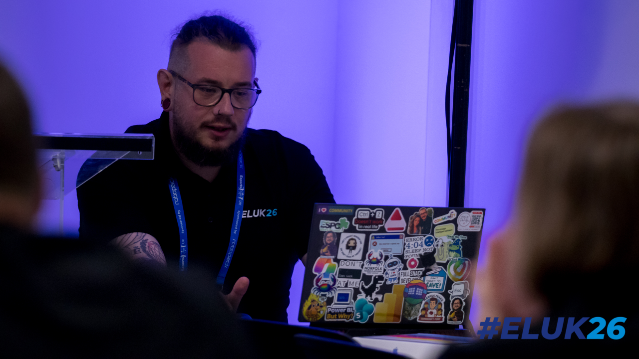
The Power BI Kinda Guy
I’m a Power BI and Power Platform consultant with a background in turning messy, real-world data into something people actually want to use. I spend most of my time working with Power BI, Dataverse, Power Apps, and Power Automate, helping organisations move from “we have data” to “we trust our data”. I’m particularly interested in report design, semantic models, governance, and making complex concepts feel simple. Outside of client work, I’m heavily involved in the Power Platform community. I run the Norfolk Power Platform User Group, help organise regional events, and regularly speak at user groups and conferences across the UK. My sessions are practical, honest, and based on lessons learned the hard way, with a focus on things you can apply the next day.

Meet Duncan next at
Collabdays Bletchley-Park-2026
23/09/2026
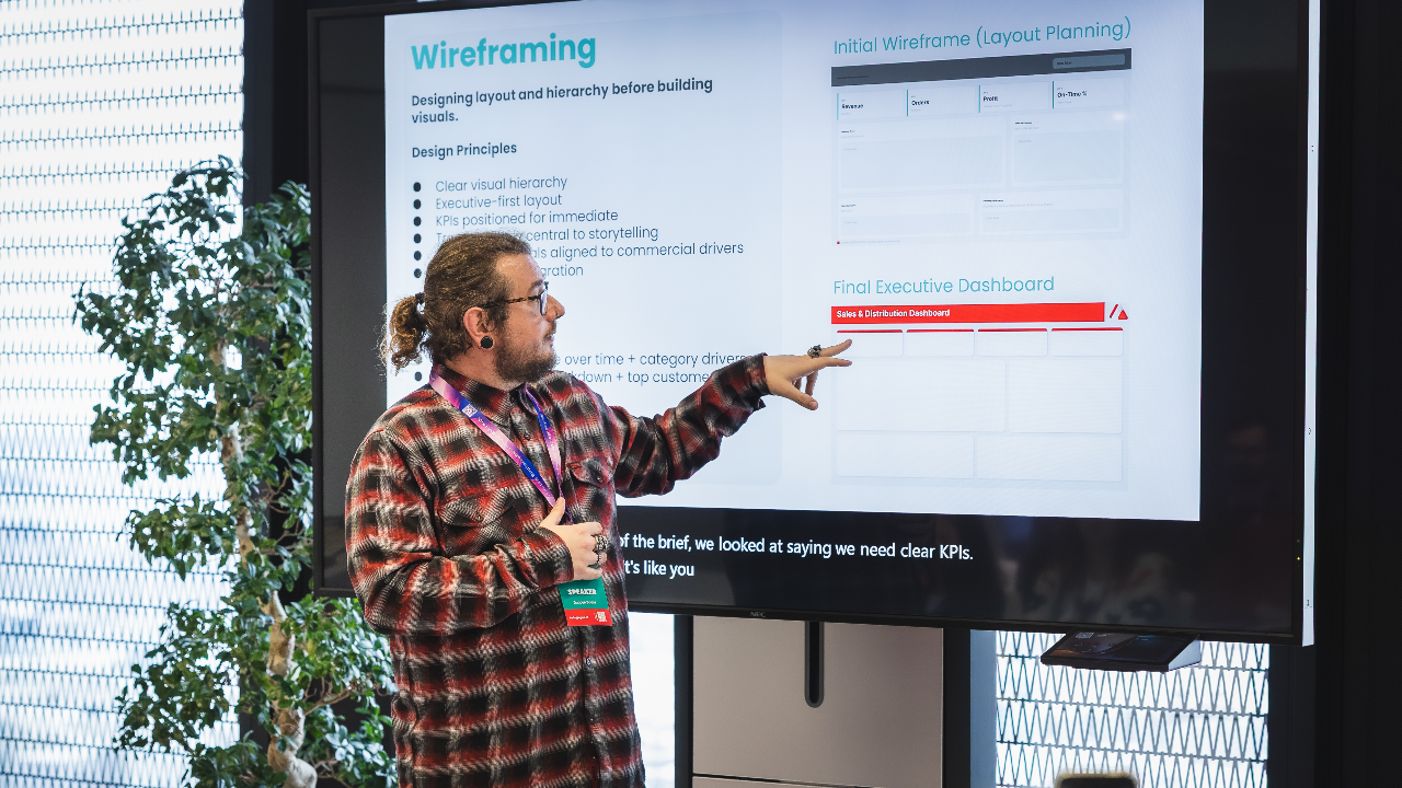
“Can you build us a management dashboard?” Most Power BI projects start exactly like this, with a vague request and the expectation that the developer will somehow turn it into something insightful, beautiful, and easy to use. Too often we jump straight into Power BI and start dragging visuals onto a canvas. The result is dashboards that look cluttered, inconsistent, and difficult to scale. This session takes a different approach: design first, build later. Starting with a typical stakeholder request, we will walk through the process of designing a Power BI dashboard from scratch using wireframes. Together we’ll decide what belongs on the page, how information should be prioritised, and how layout, colour, and typography influence the way users read data. Along the way we’ll explore questions that good report designers ask before opening Power BI: Why are we using these colours? Is the design accessible and readable for all users? How will this layout scale when more pages or reports are added? How do we turn stakeholder requests into a structured visual plan? By the end of the session we will have produced a complete dashboard wireframe and a repeatable design approach that can be applied to any Power BI reporting project. What You’ll Learn How to translate stakeholder requests into structured dashboard wireframes How to design layouts that prioritise clarity and usability How colour, typography, and spacing affect data interpretation How to design reports that scale across multiple dashboards and teams Key Takeaways A repeatable wireframing process for Power BI report design Practical design principles you can apply before opening Power BI Techniques for creating dashboards that are clearer, more accessible, and easier to scale
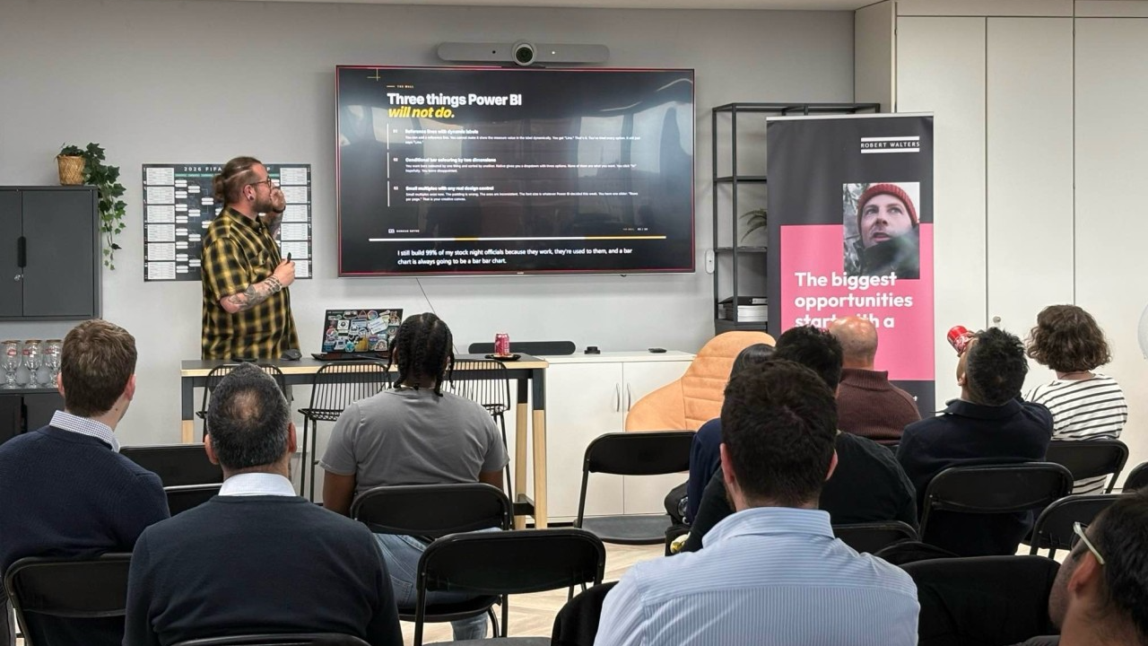
Read moreAI isn’t here to replace Power BI developers, it’s here to make us dangerously efficient. And while everyone is talking about Copilot, the reality is that ChatGPT, Claude, Grok, and even Gemini can massively accelerate modelling, DAX writing, documentation, design, debugging, and stakeholder communication. This session is a hands-on, example-packed tour of AI workflows that Power BI people can use today. I’ll show the prompts I genuinely rely on: generating DAX variations, validating logic, rewriting gnarly measures, designing report layouts, creating SVG wireframes, summarising datasets, explaining model choices, generating test data, accelerating requirements workshops, and even turning stakeholder rambling into structured acceptance criteria. This is not hype. This is not “AI will change everything.” This is the actual prompt pack that saves hours, improves quality, and makes you feel like you have a junior developer, a documentation assistant, and a design coach sitting next to you, without the HR paperwork. Key Takeaways Practical AI workflows to supercharge modelling, DAX, and design. When to trust AI — and when not to. The exact prompts you can steal and use immediately. How to blend AI + Power BI + Fabric for faster delivery and clearer insights.
Read moreA live, end-to-end Power BI build This is a demo-first session. No slide decks full of theory. No pre-built models. No “imagine if” examples. The only slides you’ll see at the start are my face and a highlight reel of things I’m unreasonably proud of—purely for credibility, ego maintenance, and to prove I’ve broken Power BI in enough ways to know what actually matters. Then we switch straight into Power BI and build a real dashboard from scratch in 45 minutes. We’ll start with raw, messy data and finish with something you’d genuinely feel comfortable putting in front of stakeholders. Along the way, you’ll see: How to decide what not to build (the fastest win in Power BI) A practical approach to modelling without overengineering The small number of measures that usually drive the most value Layout and visual choices that prioritise clarity over decoration How to keep momentum when time, scope, and attention are limited This session is about decision-making under constraint—the same constraint most of us work under every day. You’ll leave with a repeatable approach you can use when “Dashboard in a Day” simply isn’t realistic.
Read moreDesigning Production-Grade Custom Visuals in Power BI with Deneb As Power BI practitioners mature, many eventually hit the same wall: native visuals are powerful, but they impose structural limits. Layering complex KPIs, building precise layouts, or controlling visual behaviour beyond the format pane often requires compromise. This session explores how to move beyond those constraints by designing production-grade custom visuals using Deneb and the Vega-Lite grammar of graphics. Rather than focusing on basic syntax, we will examine: How to think in layers, marks, and encodings When in-visual transformations outperform DAX measures Structuring maintainable and reusable visual specifications Handling dynamic scaling, conditional logic, and controlled interactivity Avoiding common performance and maintainability pitfalls Through real-world examples, we will rebuild complex reporting scenarios that native visuals struggle to represent cleanly — such as layered KPI cards, dynamic bullet charts, and composite visuals that would otherwise require multiple visuals stitched together. This session is aimed at experienced report creators, data architects, and consultants who already understand Power BI modelling and DAX, and want to take control of the visual layer itself. Attendees will leave with a clear framework for deciding when Deneb is appropriate, how to architect custom visuals responsibly, and how to elevate their reporting craft beyond default components.
Read moreBad data doesn’t just cause a few awkward reports. It can cost real money. The question is simple… are you using AI to grow your business, or are you feeding it rubbish and hoping for the best? Because that’s the bit people miss. The blocker isn’t the tech. It’s what you’re giving it to work with. And fixing that starts with actually understanding where your data is breaking down. None of this is new, by the way. Bad data has always been around. The difference now is the stakes. AI just amplifies whatever you feed it. Good or bad. Think of it like this. AI is the building. Your data is the foundation. If the foundation is weak, it doesn’t matter how impressive the building looks. It’s coming down. This isn’t about adding AI as a shiny feature. It’s about whether your business can keep up. The companies that get their data right will move faster, make better calls, and pull ahead. The ones that don’t… won’t. And this isn’t something you park for six months while you “explore a proof of concept.” By the time that’s done, you’re already behind. Here’s a simple example. Your sales report says you sold 1,000 products. 999 at £1. One at £100. Looks fine, right? Except it isn’t real. Someone missed a decimal point. Now imagine building forecasts, pricing strategy, or AI models on top of that. You’re not just slightly wrong. You’re confidently wrong. That’s where this session comes in. We’re not just looking at it from a tech angle or a business angle. It’s both. Because that’s the only way this works in the real world. Between us, we’ve seen this play out in places like Bank of America, the NHS, McDonald's, and across UK policing. Different industries, same problem. Data quality quietly shaping big decisions. What we’ll show you is how to actually see the problem. Pull your data together. Finance spreadsheets, HR systems, platforms like Dynamics 365. Look at it as one picture, not a bunch of disconnected bits. That’s where tools like Microsoft Power BI come in. Not as the end goal, but as a lens. A way to surface what’s really going on. Because once you can see it, things get uncomfortable… but useful. You start spotting outliers. Numbers that don’t make sense. Gaps. Inconsistencies. The kind of stuff that quietly breaks AI but never gets noticed. And then the conversation changes. It’s no longer “should we invest in AI?” It becomes “are we actually ready for it?” That’s a much better question. This isn’t about leaving it with IT or a data team to figure out. It puts that visibility in front of the people making decisions. Clear enough to act on. If your data is in a good place, great. You move forward with confidence. If it isn’t, that’s fine too. At least now you know what to fix, and where to start. Because AI doesn’t fail because the models are bad. It fails because the data is.
Read moreDuncan can deliver sessions in
Duncan speaks about
Relevant industries
Connect with Duncan